Sandos
A winter visual refresh for Sandos burgers, built around its own brand colours.
The brief
Sandos sits within a larger brand line, yet its page read like any other burger shop’s. Nothing on it said who Sandos were, and the brief was a visual uplift to change that.
How we shot it
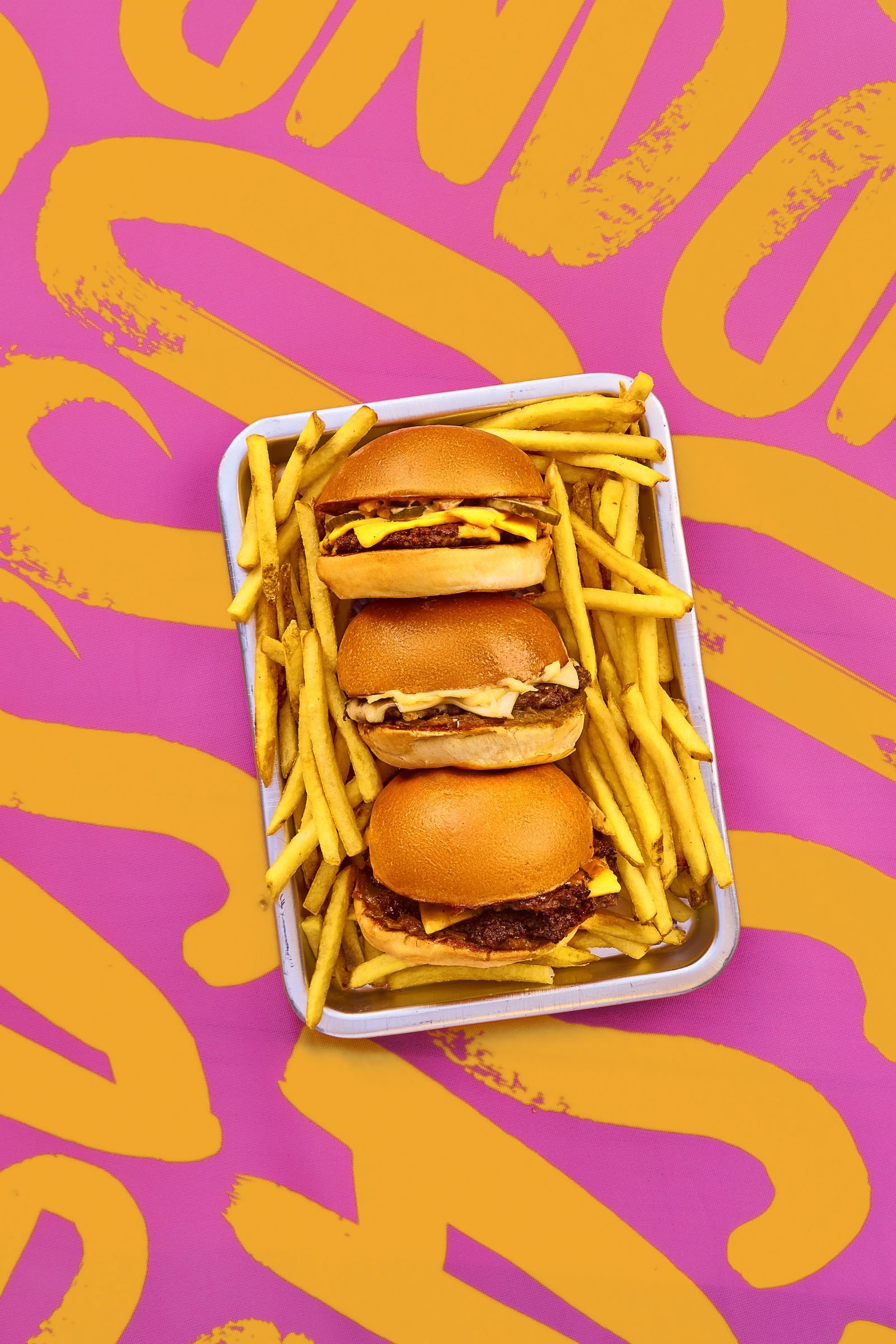
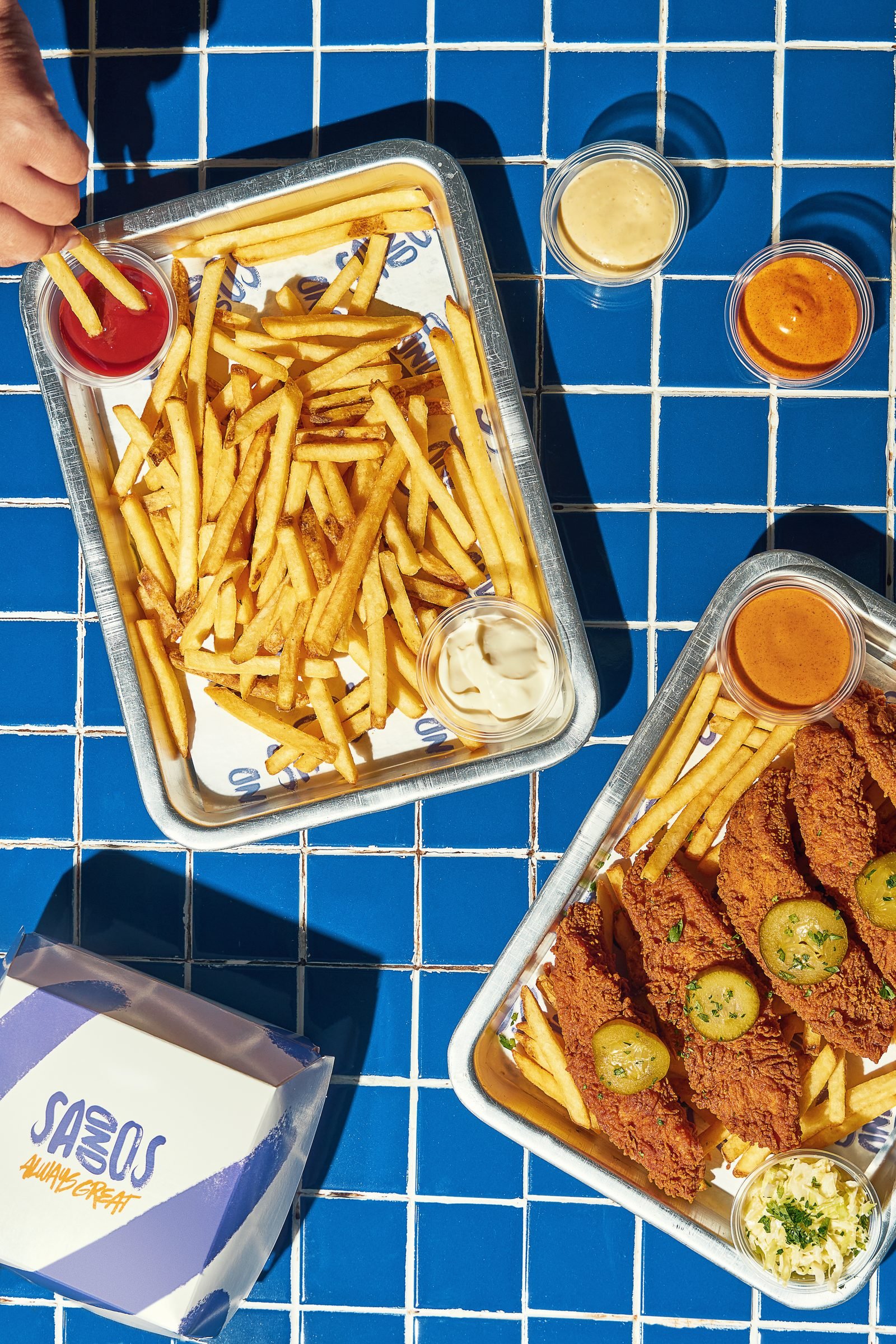
We proposed a modern, clean direction built on the brand’s own colours rather than the category’s. Sliders sit on a bed of fries against pink and yellow brushwork, while tenders and fries share blue tiles with a Sandos box. That gave the team something distinct to push through the winter season.
Selected work
Tell us about your food project
Share your brief, where the work will be used and your intended dates through our enquiry form.
Start a project brief